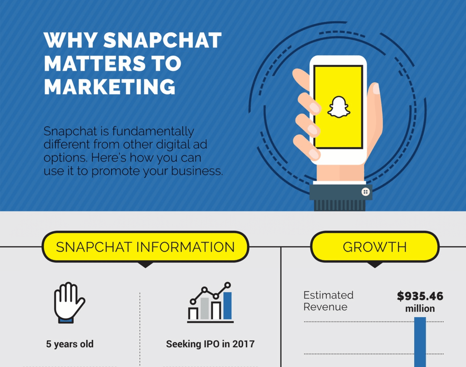
The term ‘infographics’ is a combination of the terms ‘information’ and ‘graphics’. In its most basic form, therefore, an infographic is information depicted graphically. The aim here is to showcase data and facts in a purely visual manner.
Infographics aim to present complex data and facts clearly so the audience will quickly grasp it without further explanation. it’s a highly effective way in which to convey information in a manner that is not only interesting but also engaging and easy to understand.
Types of Infographics
Although there are many different types of infographics, they typically fall into three main categories: Infographics that use
- Data visualization,
- Information design infographics,
- Editorial infographics.
When applied correctly, each of these has a specific purpose and can be a robust storytelling tool.
Infographic Design vs. Data Visualization: How are they different?
Infographics that use data visualization.
Most of us are familiar with data visualization in the form of graphs and charts. When incorporated into infographics, this results in events, facts, or numbers being visually represented to tell a very specific story. While graphs and charts on their own are objective, when incorporated into an infographic they can become powerful subjective tools to lead the audience in the desired direction.

Information design infographics.
Information design is that part of graphic design that concentrates on the effective and efficient display of information. This is a wide category that encompasses numerous functional design disciplines. Where it differs from visualization is that it isn’t made from specific data points. Instead, it uses concepts such as chronology, process, anatomy, or hierarchy.
If all of that sounds terribly complicated, it just shows how difficult it sometimes can be to paint a picture solely with words. In your everyday life, you have undoubtedly encountered information design infographics many times in the form of organizational diagrams, flowcharts, and timelines.
Editorial infographics.
Mainstream publications have been using infographics for many years, but in recent years there has been a shift in the type and style of visual content they are creating. To an extent, this has been driven by the rise of social media. Where editorial infographics of the past used to be limited to simple pie charts, line charts, and bar charts, the infographics of today have become highly shareable content that is often used by publications to boost reader engagement.
What is Driving the Popularity of Infographics?
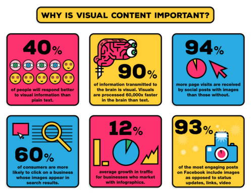
Statistics show that infographics get 94% more views than content with text only. Why are infographics so popular? The answer is that they strike a chord with the average person. They are effective in engaging people because they are viewed as appealing and attractive.
Infographics also take a lot of the effort out of processing information. For some reason, most of us are able to process visual content more easily than written content. And infographics tell a story that’s brimming with figures and facts about your business in a way that’s easy to digest.

It’s also fun to share infographics with other people. Social media is a particularly good example of this. A popular infographic is often shared and commented on thousands of times.
Get started today!
You can hire a writer at an astronomical cost to write a book about your business. Or you can get your message across by employing an Infographic Design Agency such as Visual Kiwi. They will use their Infographic Design skills to create an infographic about your firm that puts the whole story in a nutshell so powerful that it might virtually overnight become a legend in the marketplace.


